When we are conducting a risk assessment, we need a way to assess, grade and order risks to allow us to use this information for decision-making and to prioritize our actions. This article outlines some basic techniques that can be used for risk assessment grading and matrics. These basic examples lay the foundation for more complex sets of metrics that can be adapted for your organization and the specifics of the assessment. An example of the metrics used in the r = tvi construct and the risk calculation tool are included along with links to online tools that you can copy and use in your own assessments.
Risk Assessment Grading and Metrics
Whichever risk assessment methodology we use, we need a set of values to apply to each factor to help us determine a rating for individual factors and the overall risk. This can be achieved using numerical values, qualitative statements or color coding. Applying scales like these allows us to grade and order our risks which helps with prioritization and comparative analysis.
- Quantitative values allow you to easily order and compare risks
- Qualitative statements make it easier to discuss or describe factors
- Color coding provides a visual key to differentiate between different ratings
For ease, I will refer to these collectively as metrics. An example set of basic metrics is shown below.
1 Low Green
2 Medium Amber
3 High Red
Although it might seem more complicated initially, having all three options available to start with makes your assessment easier in the long run. This allows you to use the appropriate value or description to suit the stages of the process while ensuring that these are consistent throughout your assessment.
For example, you can use Low / Medium / High as descriptive terms during discussions which then become numeric values in your assessment template. These are then highlighted with the appropriate color to provide a visual key. The important point here is that ‘Low’ now has a distinct and fixed meaning and is just as explicit as a value of 1.
The same basic approach can be used for sets of metrics with more variables or options. Metrics with values from 1 – 5 are quite common. For simplicity, we are going to stick with three values for this discussion.
Tools – Risk Spreadsheets
Spreadsheets are useful tools for basic risk assessments as Excel and similar spreadsheet programs are widely accessible making these easy to complete and share. If a spreadsheet is set up correctly, it will provide a quick and easy way to manage, assess and grade risks for a simple situation.
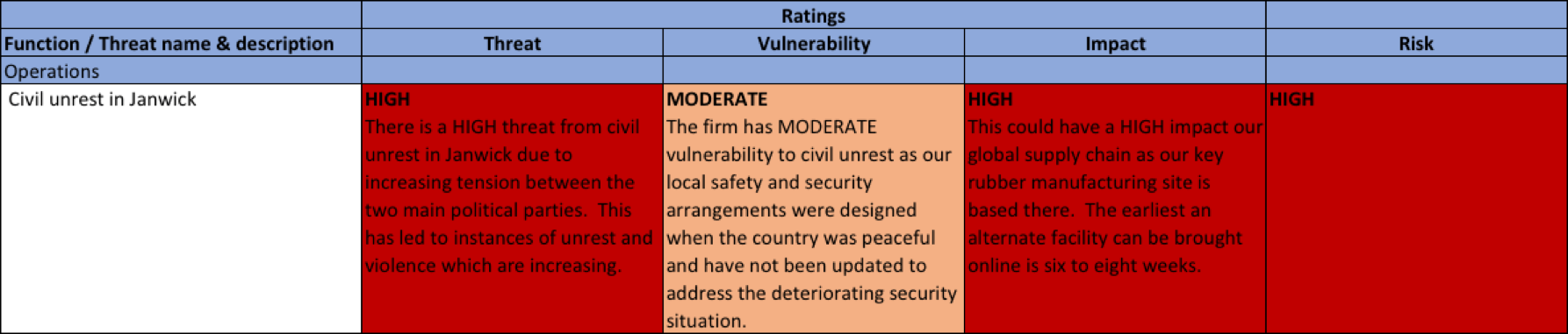
The most basic basic risk construct is risk = (threat) likelihood x impact and we can use this with the metrics described above to complete a simple spreadsheet. An example from Bob’s risk assessmentis shown below, this time, without the numeric values. However, he used the same descriptive terms and color scheme. (This assessment uses the r = tvi formula.)
Again, more complicated formulas can be tackled in a spreadsheet. The more complicated the formula, the more care that needs to be taken to ensure that all of the links and formatting are set up correctly.
A link to a basic risk assessment template can be found here.
Tools – The Boston Square
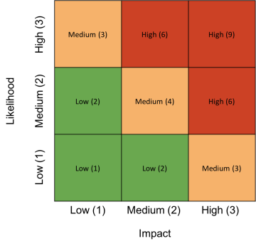
The Boston Square is another popular tool for risk assessments and can be used as a stand-alone tool or a way to represent risk results. The Boston Square presents information with two values on a color-coded grid. This works well if you are using the basic** likelihood x impact** formula: you simply allocate an axis to each factor and plot risks on the grid accordingly.
This example shows the overall risk value for each quadrant:
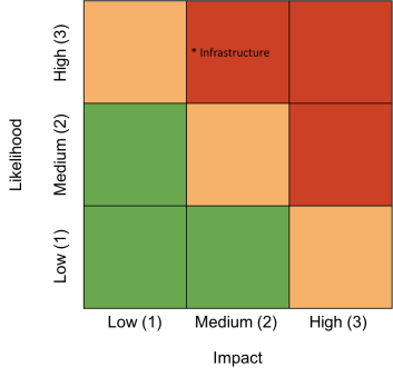
 This example shows the infrastructure risk as described in the **likelihood x impact **spreadsheet above:
The Boston Square is often used as a simple way to brainstorm risks in a workshop. Note that this approach allows a lot of bias and subjectivity into the assessment, rather than evaluating each risk on its own factors, so there is a tendency to immediately start to compare risks to one another.
Although I would recommend that you use a different tool for assessing your risks, the Boston Square can still be used as a way to represent the findings of your assessment. You can begin by assessing the risks in a spreadsheet before transferring the final results to an appropriately marked Boston Square. This provides a simple way to represent your findings while maintaining the objectivity of the assessment process.
A blank Boston Square is also included in the assessment template.
A more Advanced Methodology
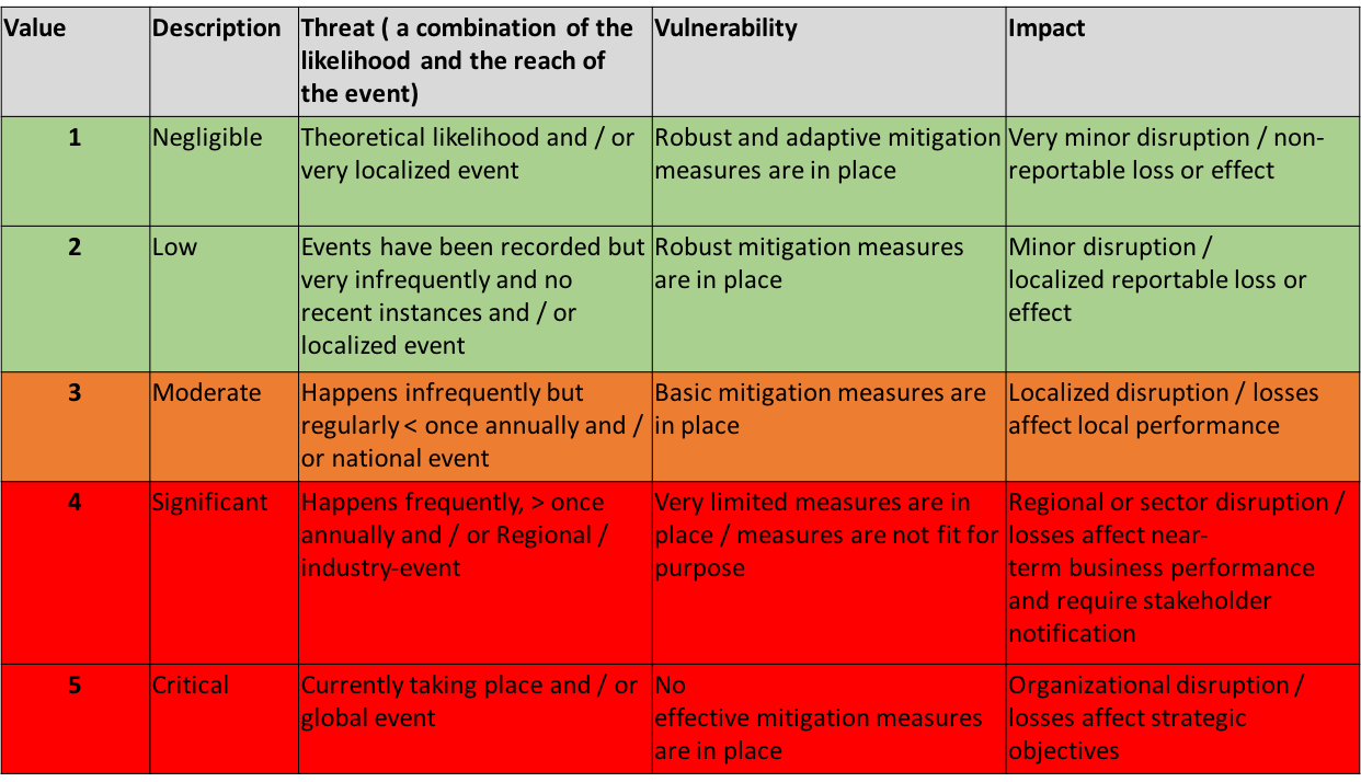
Ther = tvi formula that I prefer uses a similar metrics structure but has five different values and ratings to allow some additional refinement in the results. The metrics are shown below and I have also included a short description of what each term could mean when used to describe a different factor. These definitions are not fixed and this is something that can be adapted for your organization or the particular assessment.
Although this is a little busier than the previous example, the underlying concept is the same. A value, color or term can be applied to each factor.
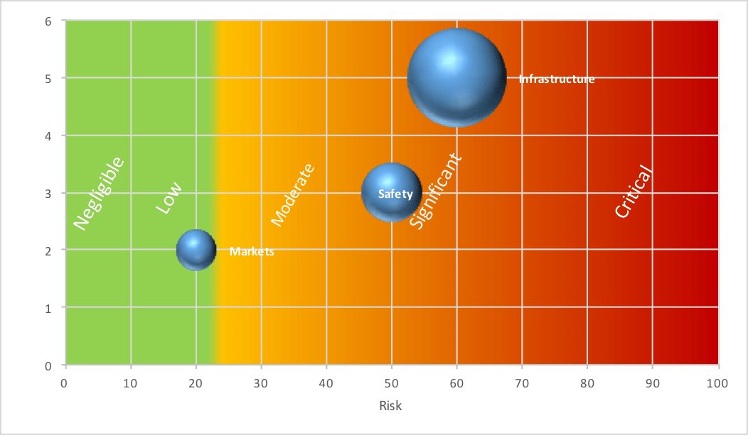
We are also unable to use a Boston Square now as that limits us to two factors but we can use other graphs and charting tools to represent our results, as required. An example of one comparison graph is shown below. It illustrates how overall risk can be compared to the likely impact of an event. This helps highlight higher impact events irrespective of their overall risk as these can be particularly damaging to an organization.
(If I am honest, I found that I was struggling to do this in a spreadsheet as these were getting quite large and complicated so I built a piece of software to help with this. It’s online for free and you can read more here.)
Data Visualization
For example, in this case, although safety and infrastructure threats pose similar risks and would both fall into the ‘significant’ category, infrastructure risks carry potentially higher impacts which might prioritize this as an area for action.
Summary
There are many systems and methodologies for risk assessment. Most involve a set of metrics with some combination of descriptive terms, quantitative values and a color-code. Personally, I now use the **r=tvi **model and the assessment tool I built for assessments. I save the Boston Square for more subjective brainstorming to compare options.
However, whichever approach you use, the options outlined above offer a basic frameworks that can then be built upon for more complicated systems that you can adapt for your own assessments in the future. The key thing to ensure is that you have a clear and robust system of grading and metrics in place before you start.
~Andrew
If you enjoyed this, please sign up to get new articles and news emailed to you directly