Full disclosure: this is me working through an idea in public but, if you’ve been reading my stuff for a while, you’ll know that the blog and email are often me thinking out loud, trying out ideas to see what sticks.
In this case, it’s not a new idea but, instead, a rather old one. A 20-year-old one…
Data-Driven Risk Management
How this came about isn’t important, but since my first risk assessment, I’ve felt that there’s a need for some kind of simple math to underpin things and help with consistency. Eventually, that became the kind of thing you’ll have seen in the metrics and gradings work here.
However, there was another thing on my mind: how can we feed data into our assessments to 1) remove objectivity and 2) speed up the process? So, instead of having to assess each threat manually (calculating its likelihood and severity), wouldn’t it be better if we could track a few metrics which would give us the same result without the friction of evaluating each element individually? And wouldn’t that also remove many of the biases and inaccuracies we get when humans assess things?
Even more importantly, if you identified the key metrics or events that show things changing, you’d have a set of triggers to look out for. These could be a series of smaller events that combine to bring about a change or one big event that changes everything.
This is what my idea looked like in 2005.

Some of the original work on event tracking and triggers from 2005
Great Idea, One Small Problem
However, there’s one problem.
Knowing what to track.
Because each country, business, and organization is unique, each is affected by different factors. And even when the same factors are relevant, the degree to which these affect the organization will change.
So this is a hard problem which is why I’m still working on it 20 years after I started.
But it’s also a solvable problem. Control Risks does a version of this for country risk, and firms like Palantir use big data sets and machine learning to assess risk and help with decision-making. Investors and fund managers do this kind of thing all the time.
However, these systems are too complex for individuals and small organizations to apply, extremely expensive, or both.
Moreover, I don’t think big is always better because, as we can see from catastrophic events like the great recession of 2008, having all the data is useless unless you are honest about what it means. In fact, a lot of research suggests that having more data makes your evaluations less accurate.
Risk Metrics – The KISS Version
So the experiment is this: to find a set of metrics to track to help with risk evaluations and decision-making with the caveats that the metrics are:
- Broad, not narrow (meaning the metric has widespread effects)
- Publicly available
- Easily understandable
- Updated frequently
- Commonly used
So, GDP or the price of a barrel of oil meet this definition, whereas a hedge fund’s pay scales would not.
Once we have this set of metrics, the next step is to ask ‘so what?’ in relation to the general effects this element has on businesses and organizations. However, it’s important to look at first- and second-order effects to have real value. For example, the price of oil has a direct effect on transportation and heating costs, but it also impacts countries that provide file subsidies: rising costs squeeze budgets, whereas lower costs produce a financial surplus.
Finally, you then work out what ‘normal’ looks like. This can be based on historical values for that metric but also on what the operating tolerance is. Again, for the oil price example, we have years of data and can use two or three-year averages to get a sense of normal. We could also see what normal, day-day fluctuations look like to give us a +/- percentage band for our normal value.
So in combination, what we’re looking for is a group of metrics we can track, establishing their normal value, and determining how changes to these values could affect our organization or whatever entity we’re thinking about. Then we can put them to work as either raw data for risk assessments or as a set of triggers we track to identify potential changes in a situation.
Using Data For Risk Assessments
Using metrics for assessments requires a bit of pre-work as you need to put the data into a format similar to the grading system you use for your risk assessment. You can do this by either using the spread of the data or applying the data to a likelihood/severity matrix.
Using a Data Spread
Establish the spread of what the values could be and then correlate these with an assessment valuation. For example, from very low to extreme (very high). You could do this by taking historical highs and lows and basing your valuation scale on these. Calculate the difference between the highest and lowest value and divide this by three. Then, starting with the lowest historical value:
- Anything below this would be classed as very low.
- The historic low value plus 1/3 gives you the spread for the low band.
- The top of the low band plus 1/3 then gives you the spread of the moderate band.
- The top of the moderate band plus 1/3 gives you the high band spread.
- The historical high or above gives you the severe band.
(Note that both the top and bottom-most values are open-ended here.)
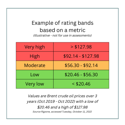 Example of a rating system based on a set of metrics
Establishing these bands and thresholds is probably the most complex part of the whole thing, and there is a lot involved in getting this right, so the 1/3 rule example is a very crude start (pun intended).
Using a Likelihood / Impact Matrix
Alternately, where you have data for likelihood and impact, say for hurricanes, you can apply this data to a matrix to get a threat description. You will have to establish standard definitions for each grade for Likelihood / Impact, but once you have these definitions, you can work through each data point to develop a rating.
It’s important to avoid calculating the impact on your business or organization here. Instead, you are assessing the potential impact the event could generally have. For example, the data may show a moderate chance of a hurricane, but any storm would be of significant magnitude meaning you would assess the threat from hurricanes as HIGH, which would apply to anything in the area affected. When you conduct your assessment, you use this HIGH threat value but calculate the impact on your organization specifically, taking into account your vulnerabilities and mitigation measures.
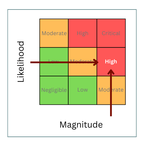 Establishing a threat rating using an impact likelihood matrix
Using the Metrics As triggers
Using data as triggers is relatively straightforward as you base these on the baseline or normal levels you calculated. Then you can establish severity bands above and below your normal operating band. These bands correspond to different degrees of change from normal, say small, moderate, or extreme. The speed and magnitude of the change correspond to different decision points or actions. So you may end up with statements along the lines of: ‘if we see metric alpha hit 87,000, then we start planning for contingency y. But if it goes over 99,000, we implement contingency z immediately.’
(There’s a video here showing how you can use triggers and decision points for contingency planning.)
The Big Question Is…
But what are the metrics?
That’s where I’ve gotten wrapped around the axle before but I’ve identified around 20 metrics so far. I’m going to investigate these in more detail over the next few months and I’ll look at how useful the data is once I’ve applied it to a model I’m building.
If you want to see the working list and vote on what’s important to you, there’s a list here
As I go, I’ll share the results in the blog and will open up the model as I get that into shape. I’ll also give you some ideas of how to use any data set that seems to have very wide application and broad effects as these might be worth tracking yourself. I will also sketch out some of the first and second-order effects of changes to these key (essential? macro?) metrics to help you apply these to your decision-making.
—–
As I said, this is a big topic I’ve been working on for a long time, although pretty intermittently. It’s also a challenging problem and one that has seen off better people than me. However, I think that a simple model will help speed up, simplify and remove the subjectivity from risk assessments. In turn, that will help improve the speed and quality of our decision-making so, overall, I think this is still a project worth pursuing.
Stay tuned! More metrics to follow!